Brand refresh
ray-ban 2022
ART DIRECTION
The brief
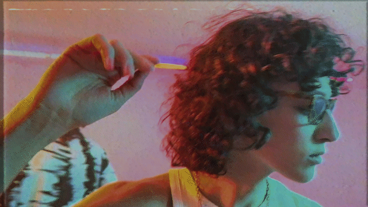
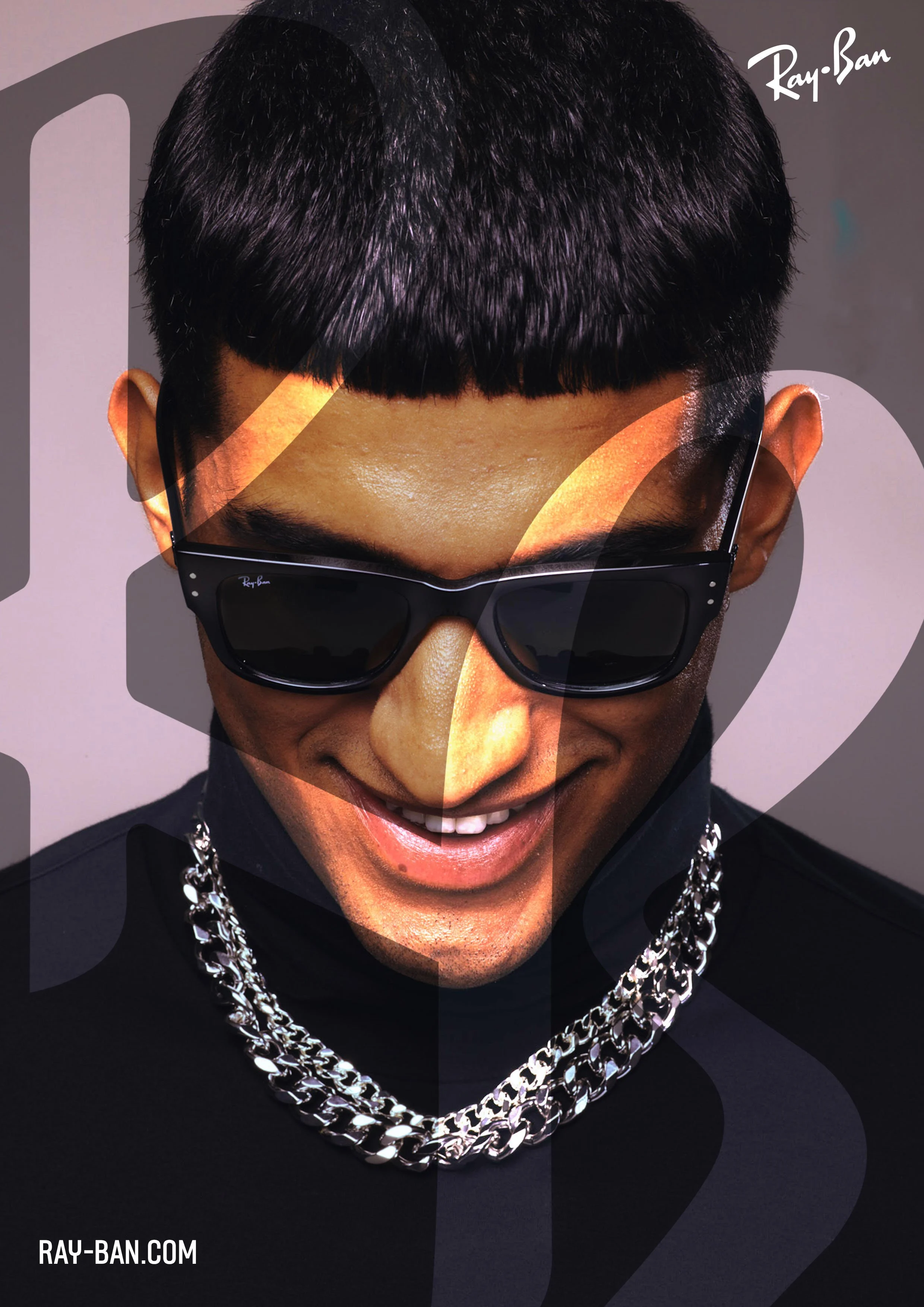
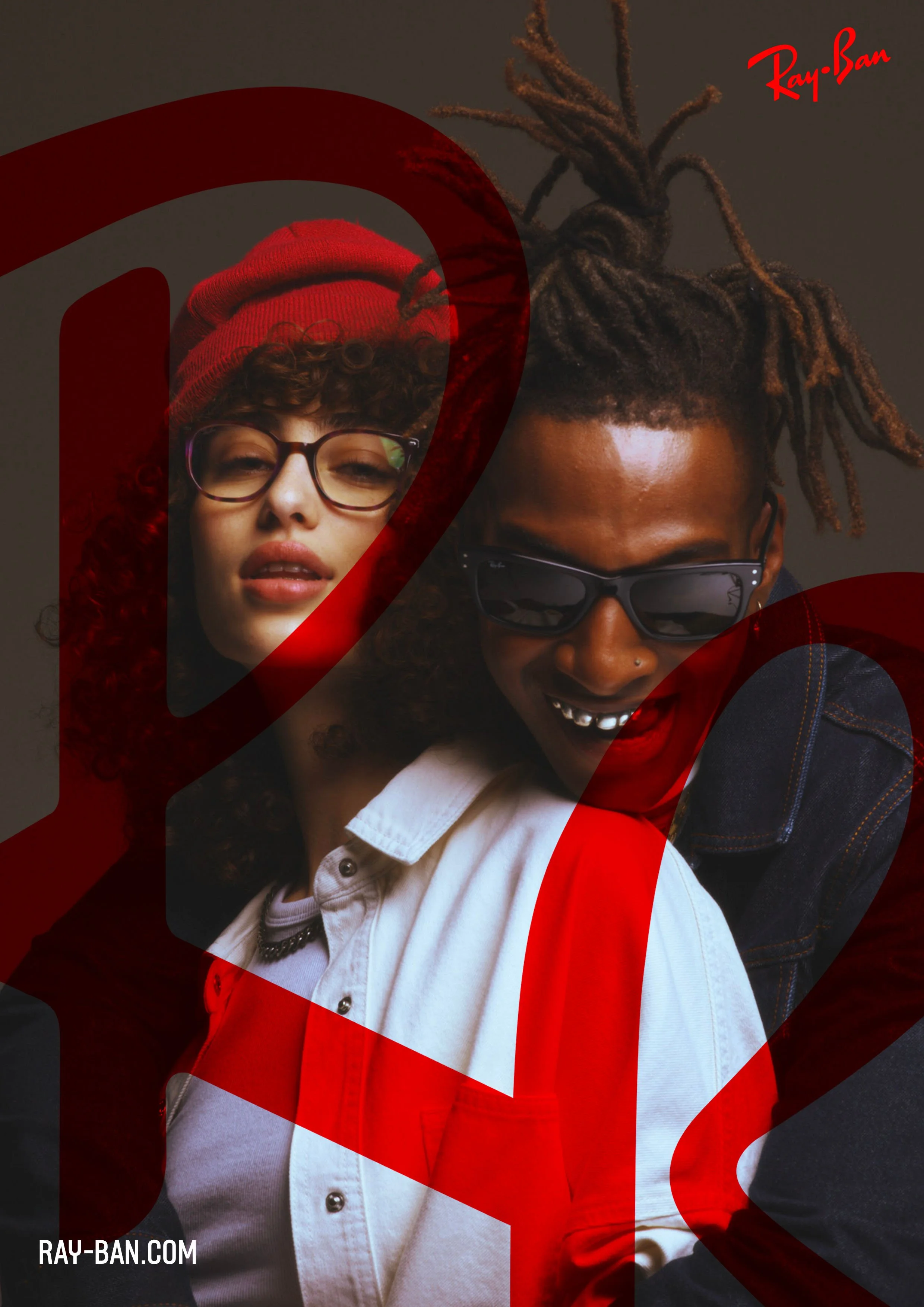
The brand was in need of a refresh in 2022 and with a new campaign on its way shoot by jack bridgland the need was to also update the brand codes.
The ideA
To strip the brand from the decorative elements and to keep only the essential WHILE STILL PAYING TRIBUTE TO THE BRAND HERITAGE.
To understand what is visually ray-ban we started by analyzing the archive, to see what has been there sin 1937.
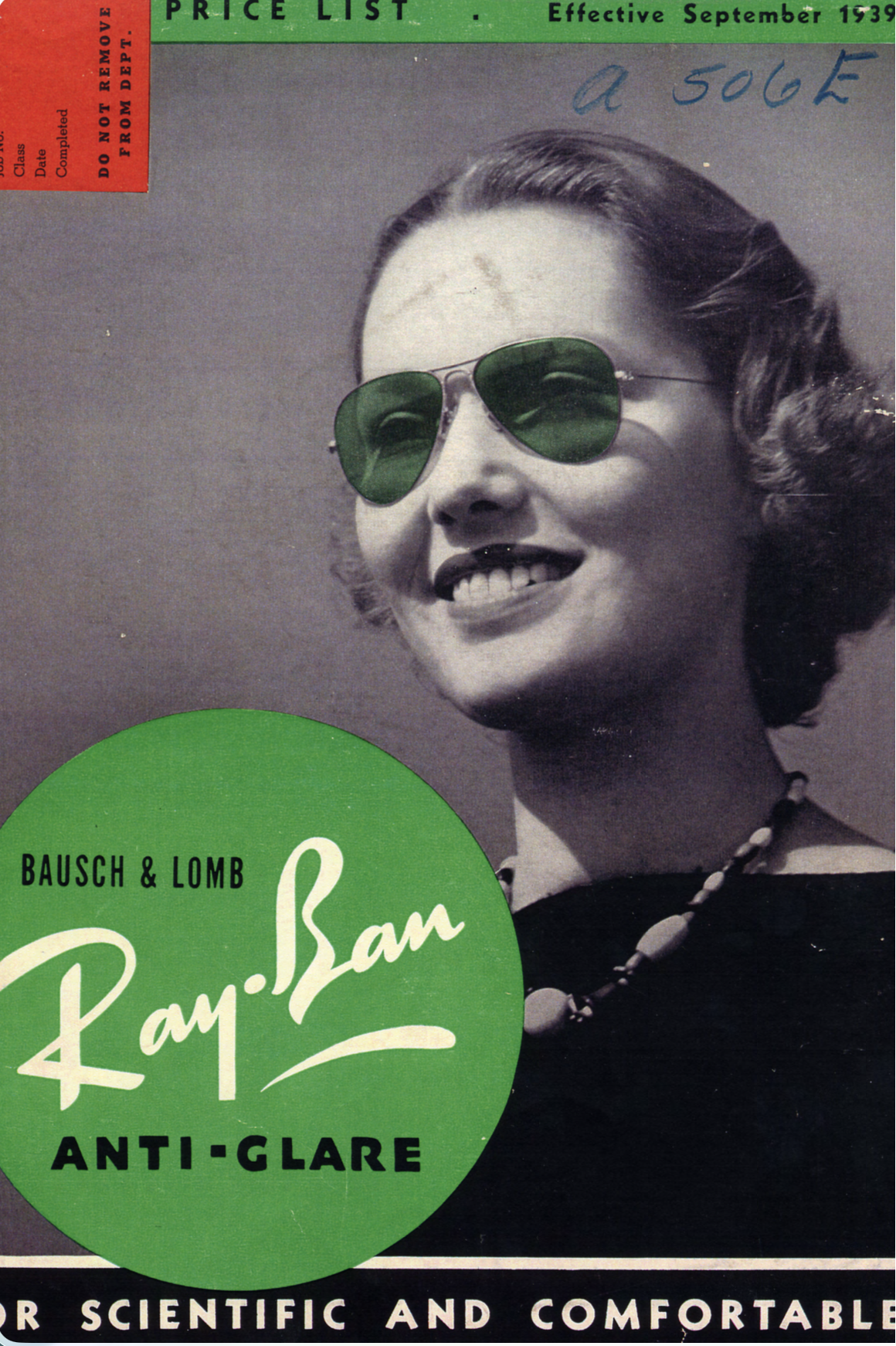
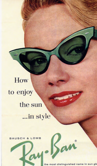
Before having it’s iconic red box, the woodmark was always placed as one of the main elements of the branding. We decided to pay tribute to the heritage of the brand, by bringing back the use of the free woodmark.
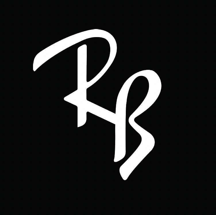
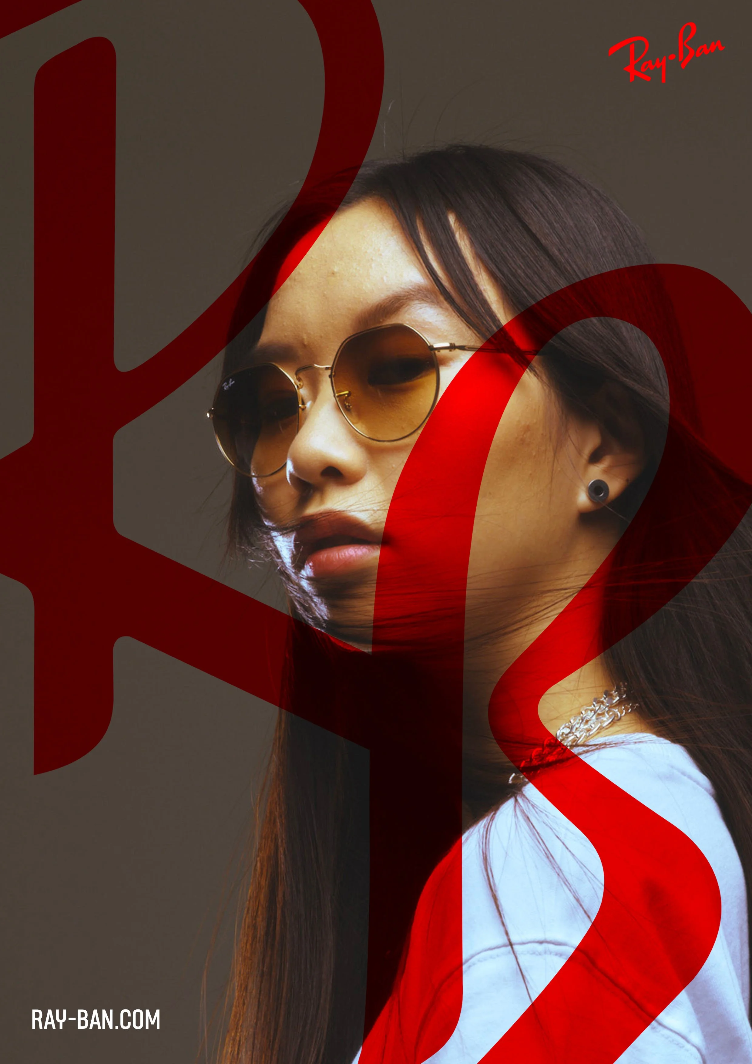
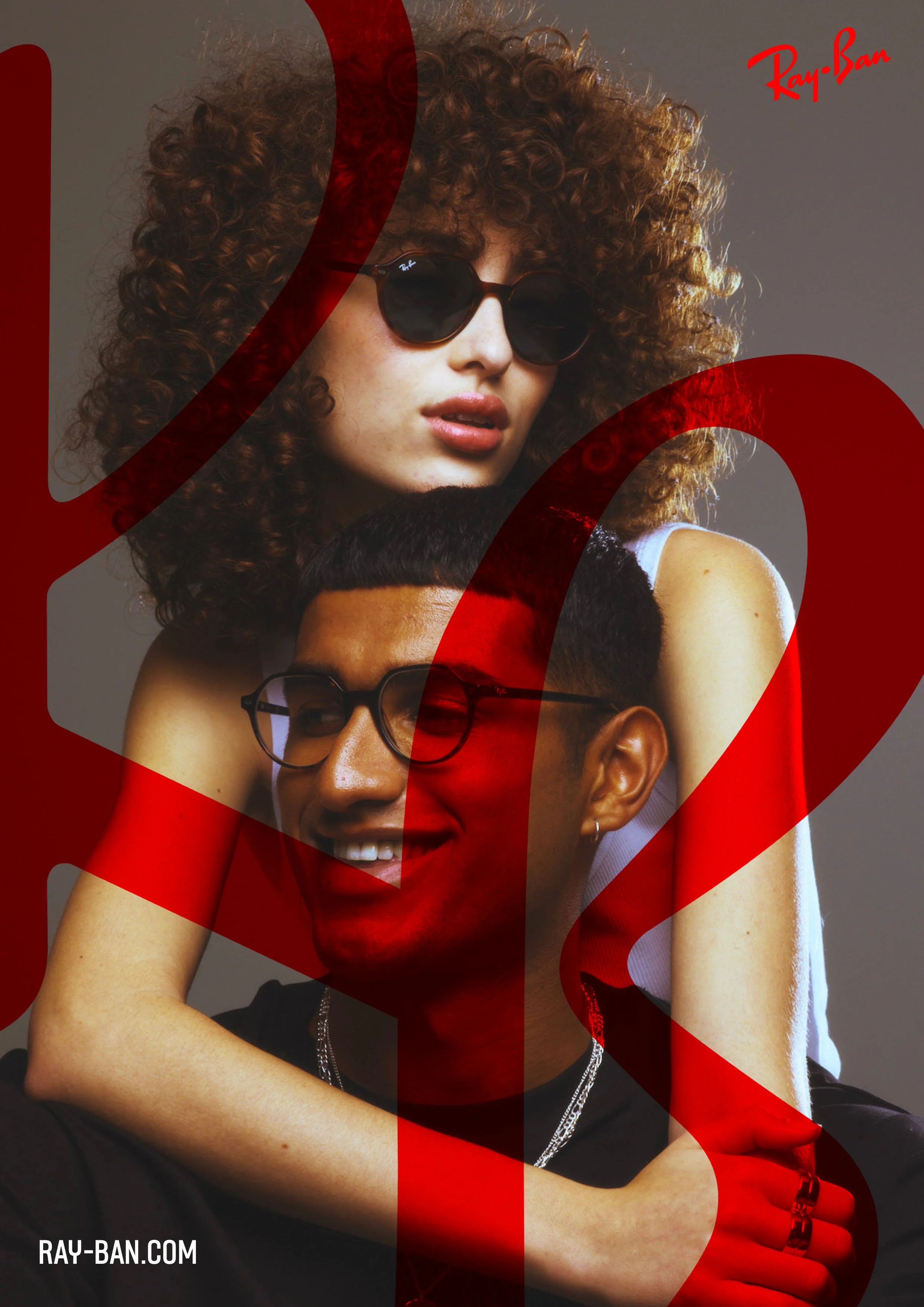
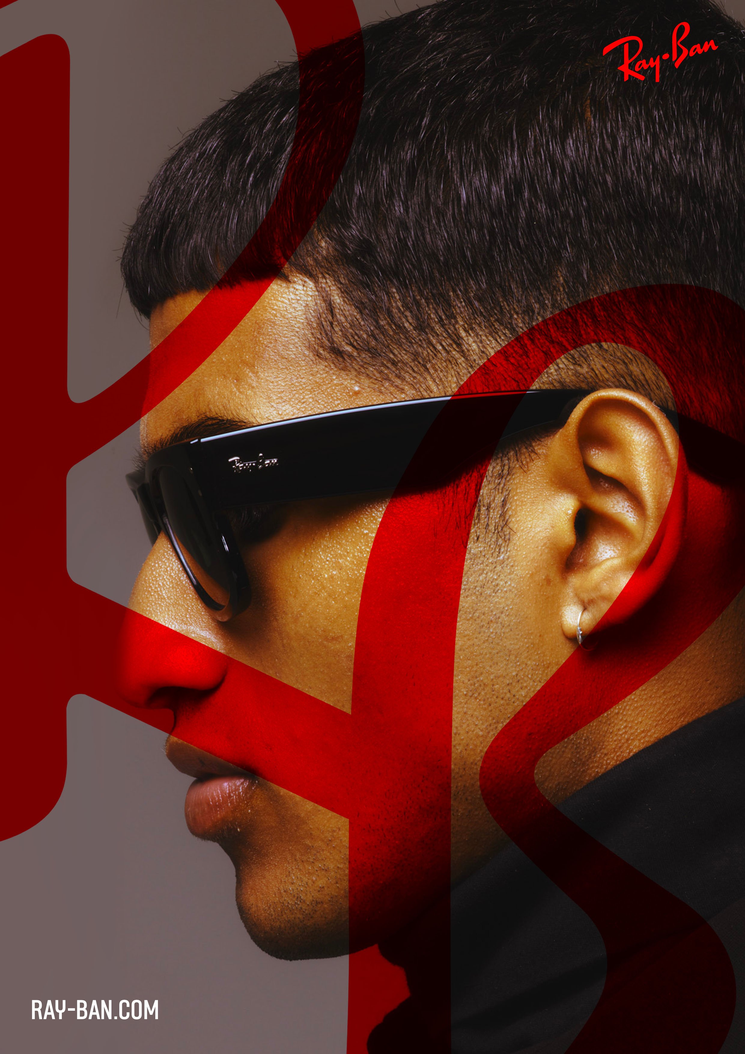
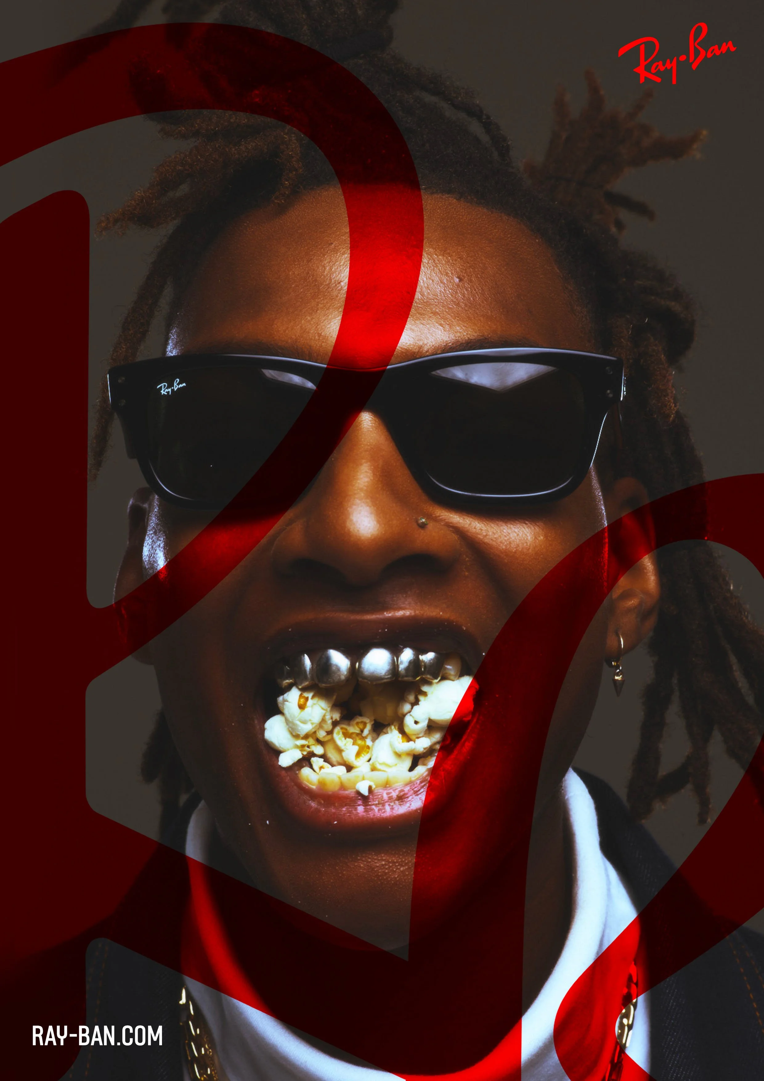
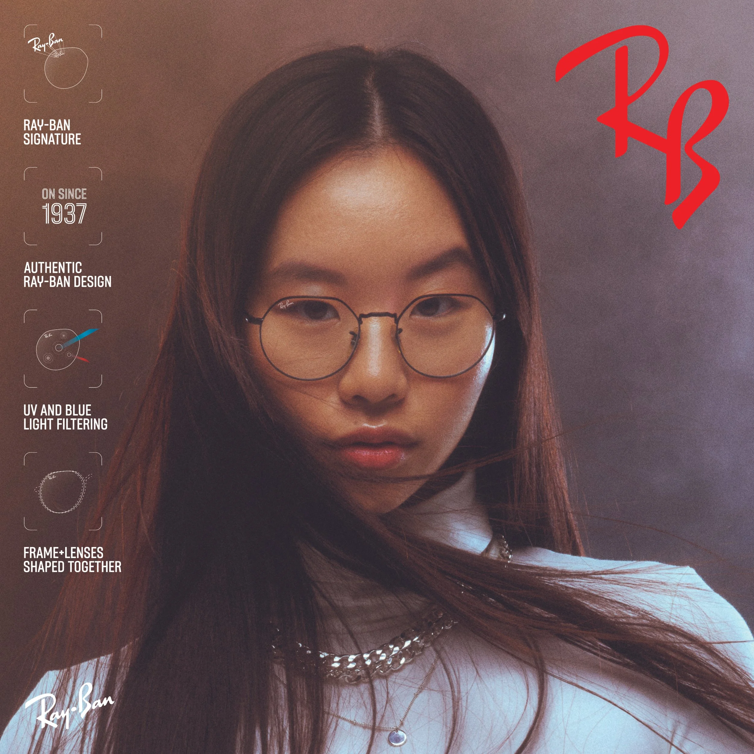
We also decided to bring back an iconic symbol of authenticity already present on the product, the RB which is engraved in all the original lenses.
An iconic woodmark
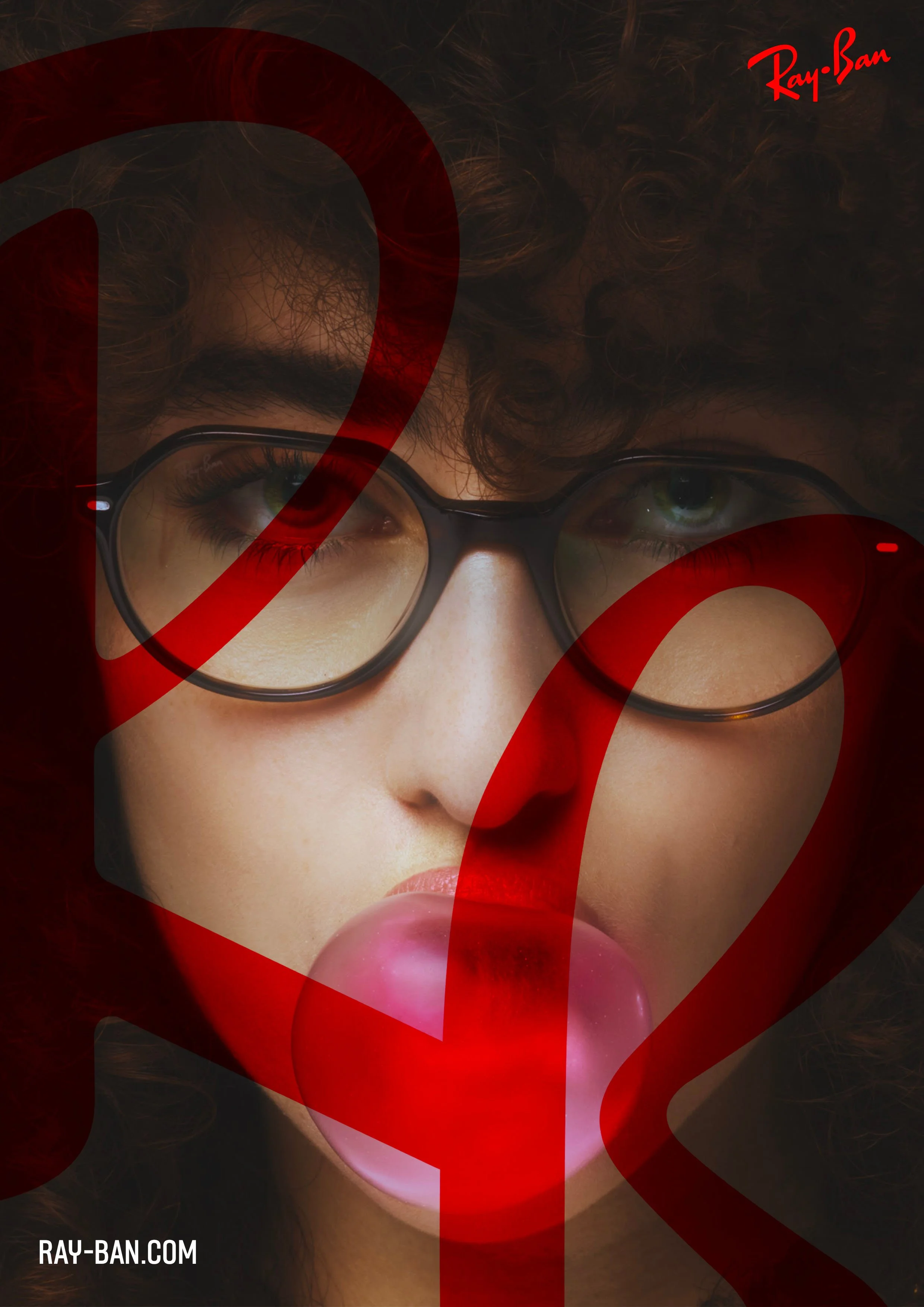

a symbol
of authenticity
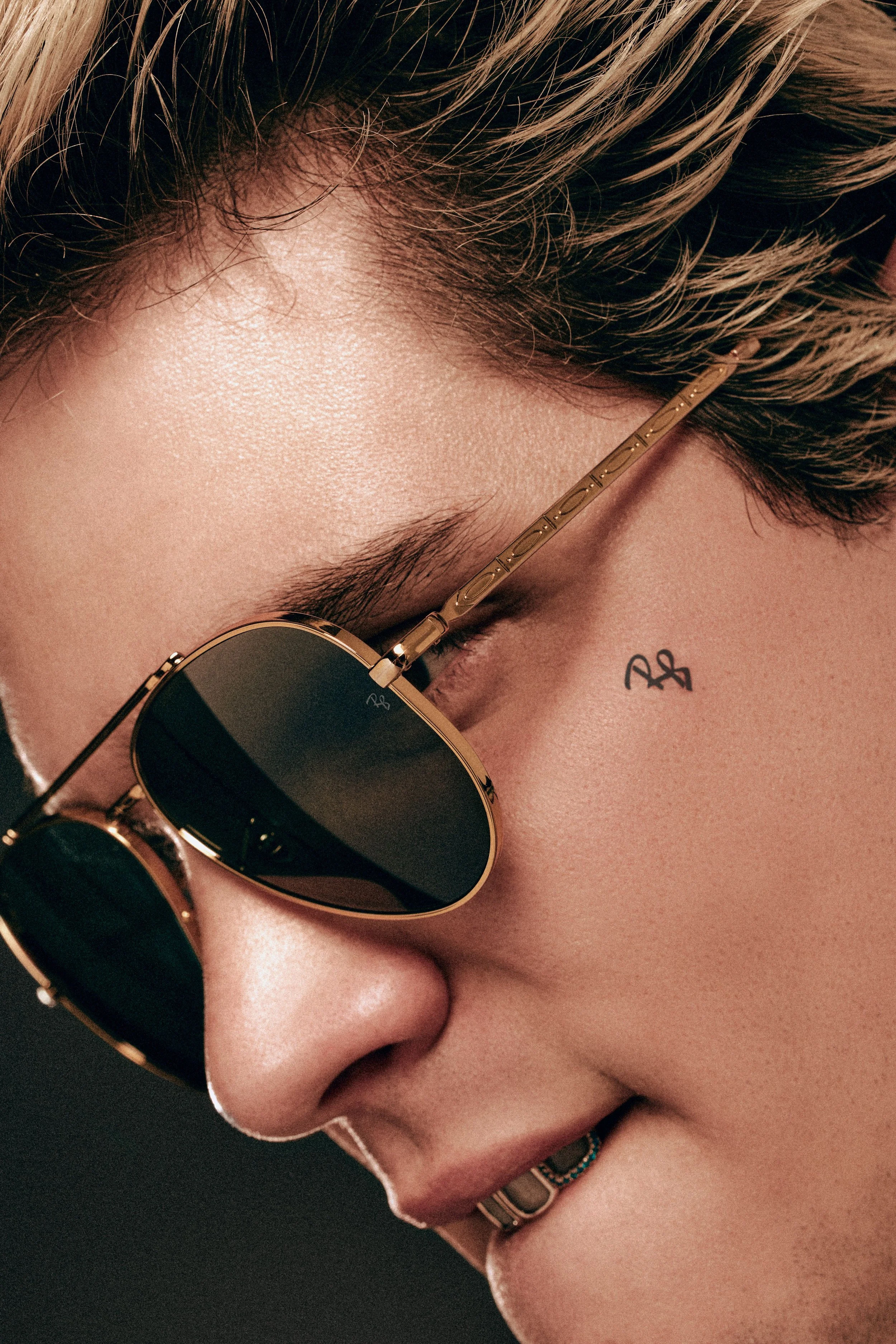
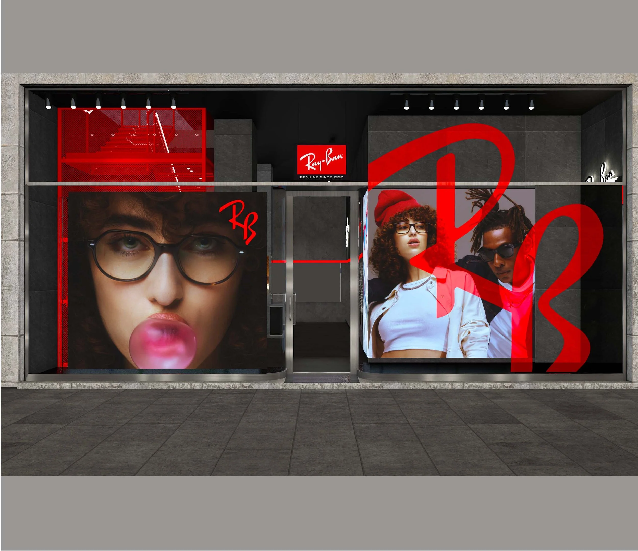
The new symbol was placed in all the channels. On the long run, the symbol became an easter egg in all the campaigns of the brand.
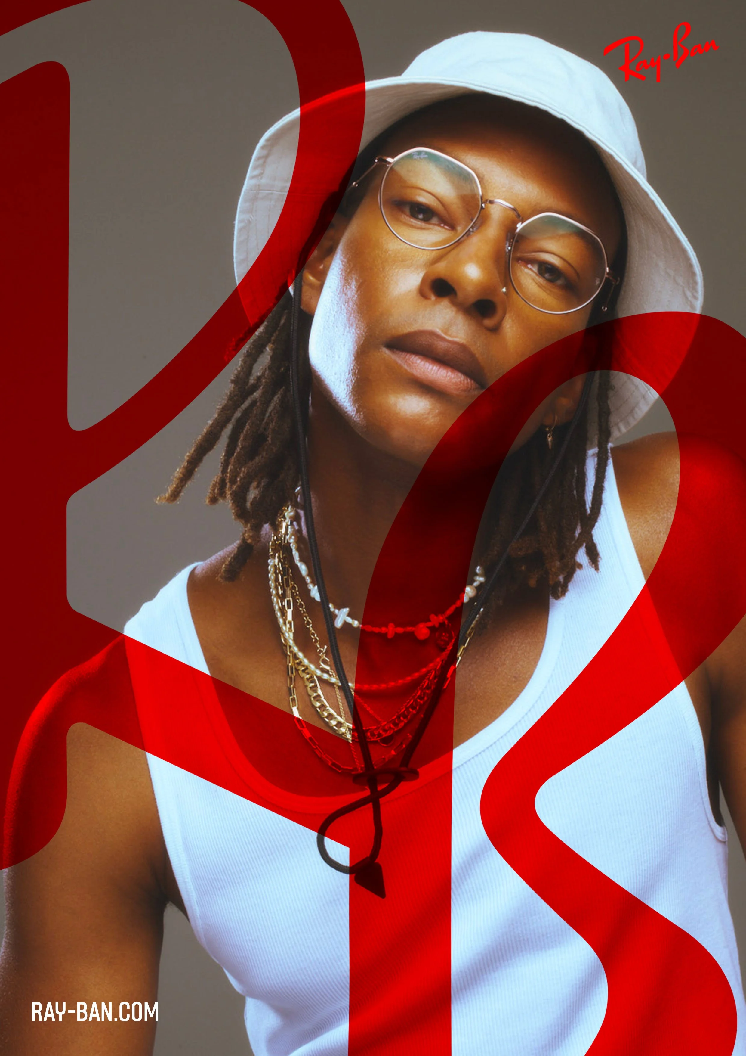
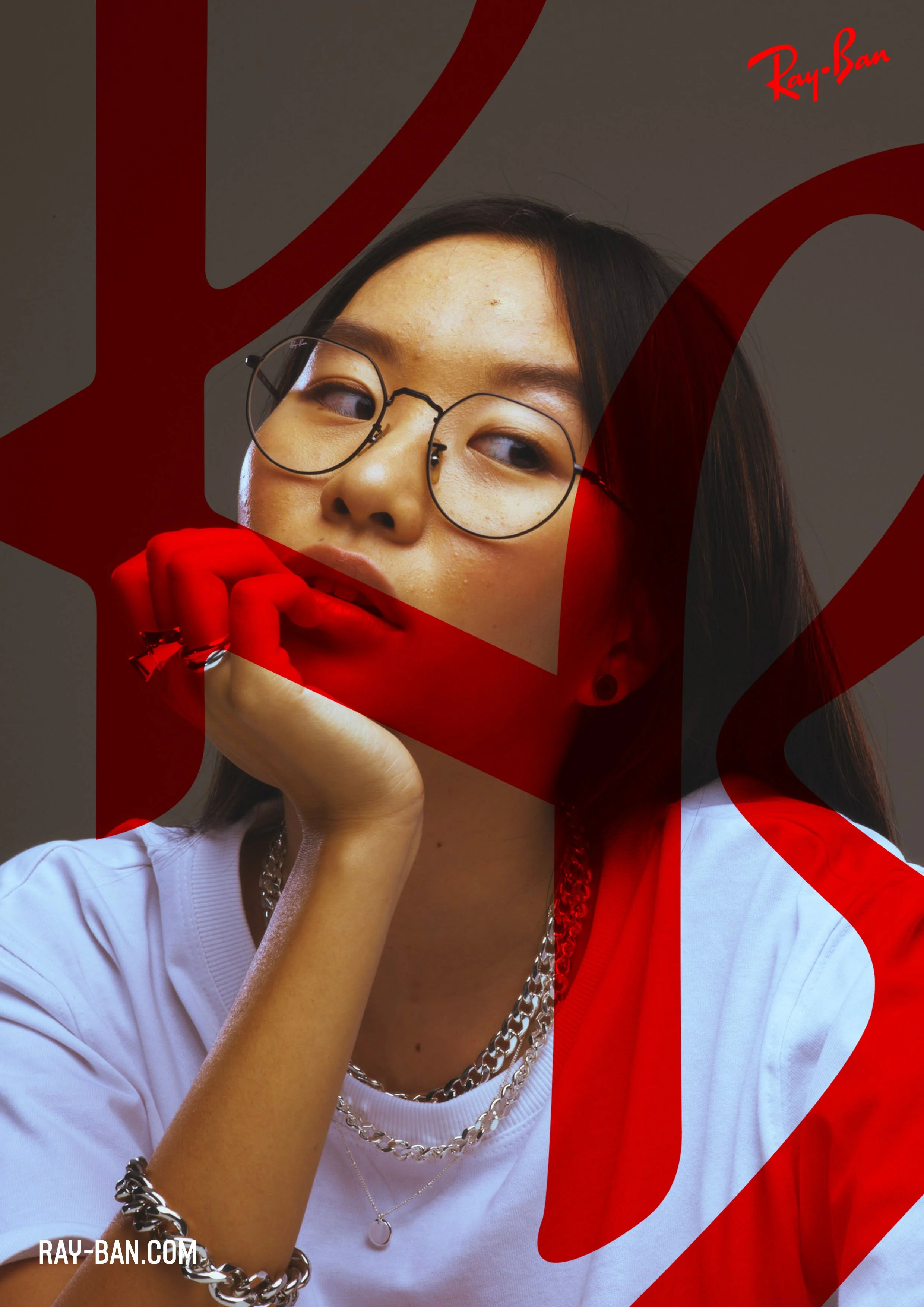
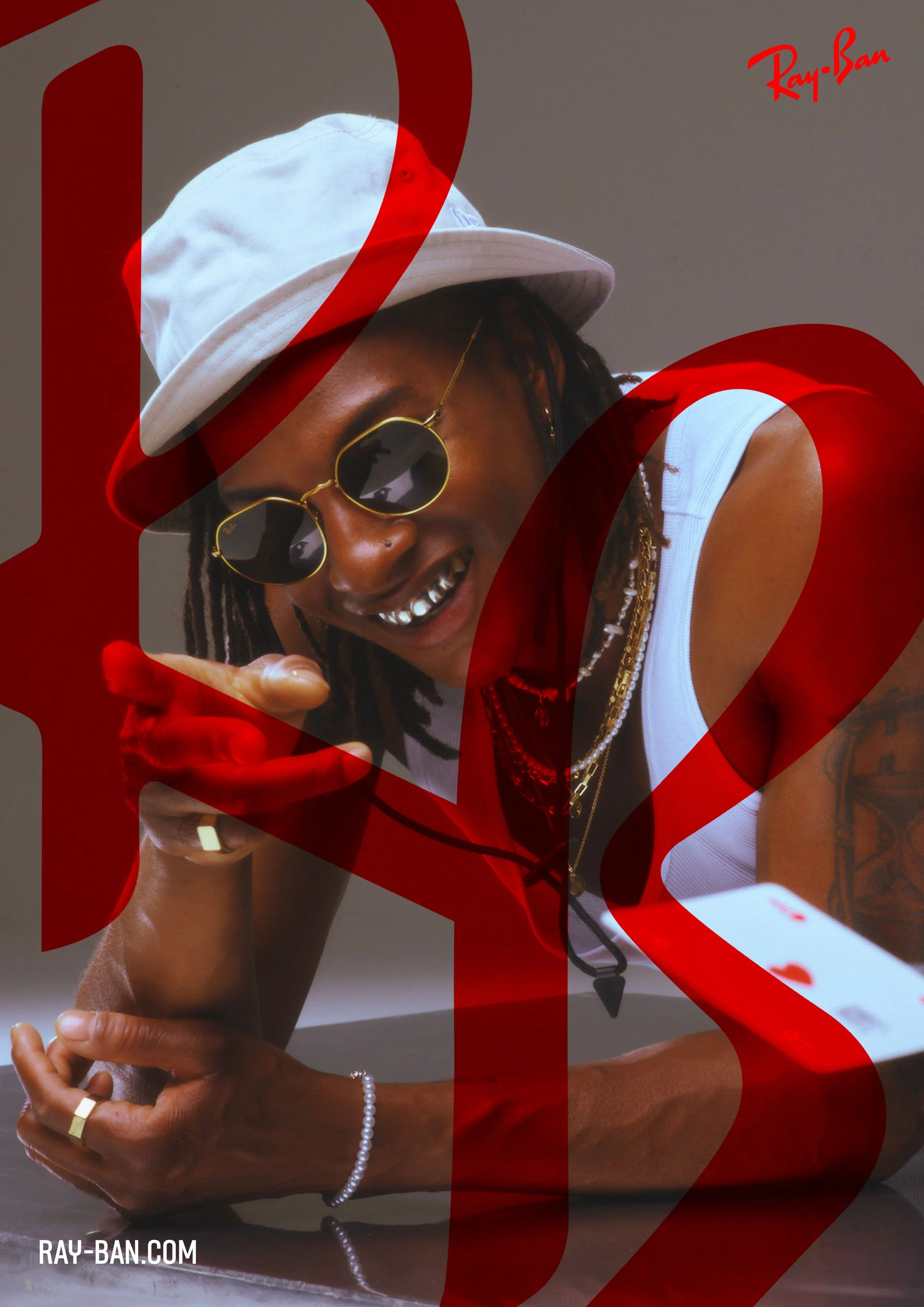

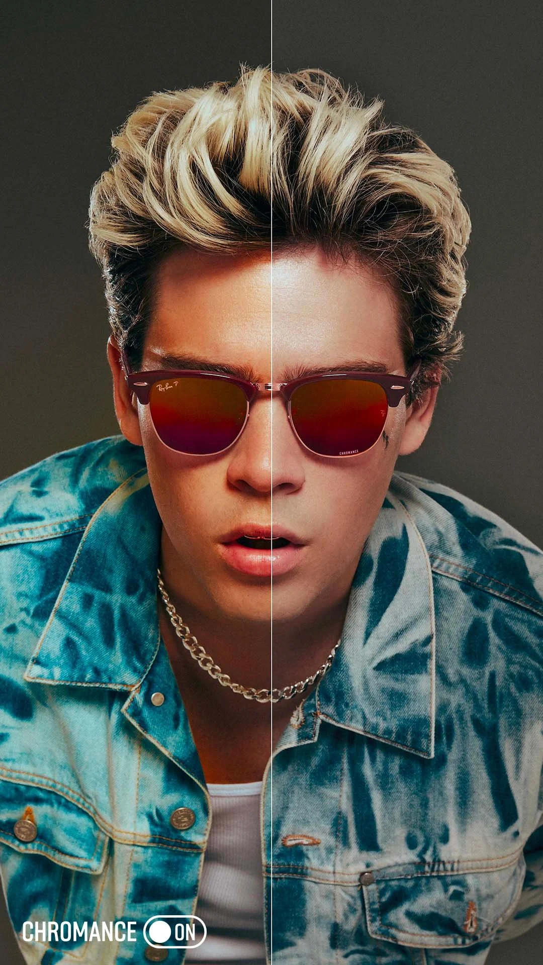
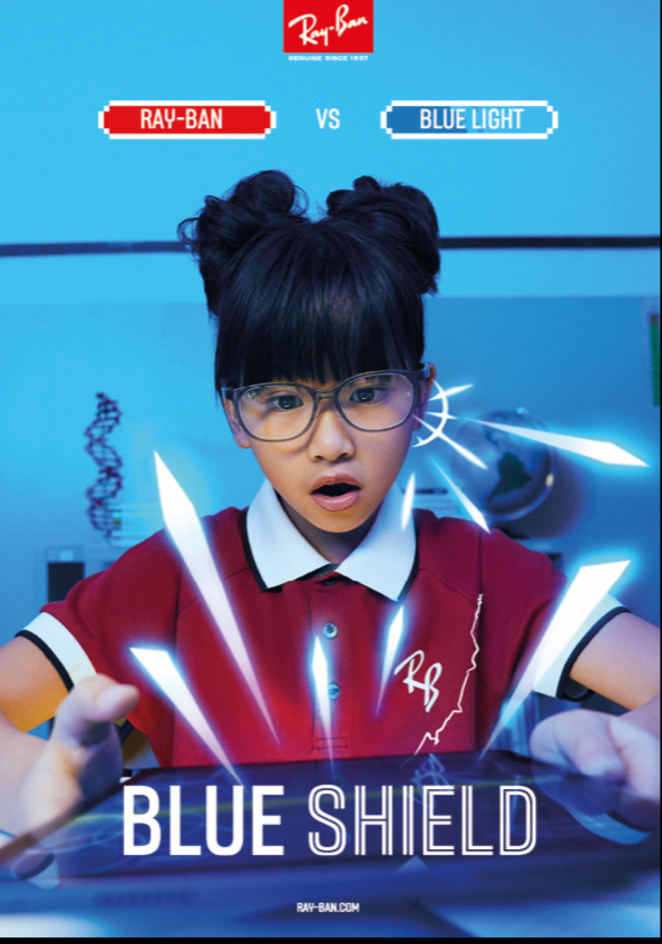
The new brand codes were also applied to all the cattegories
CREATIVE DIRECTOR: ELMAR DE JONG | ART DIRECTOR: MIGUEL ROLDAN |